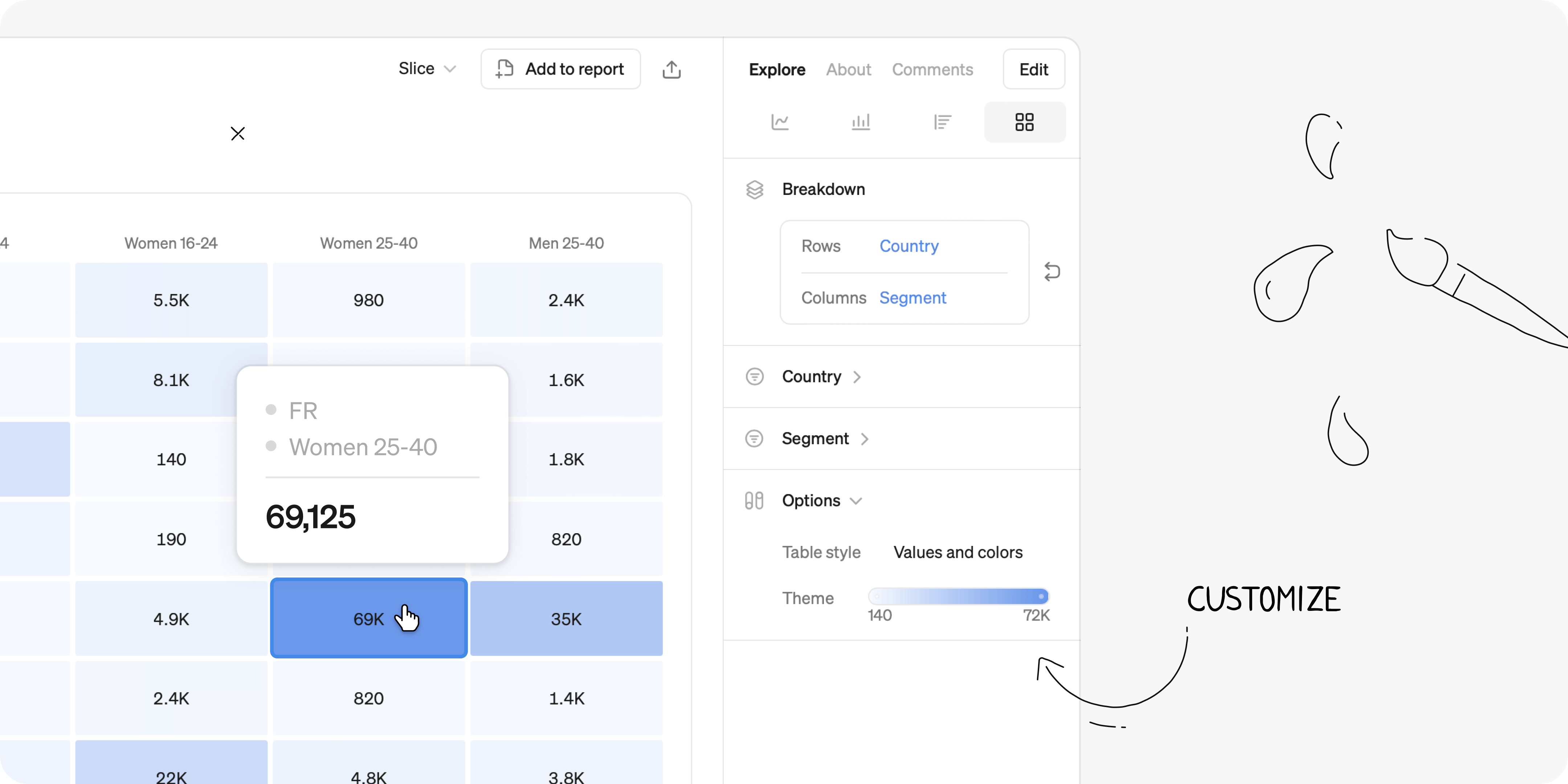
There are fancier analysis techniques out there, but nothing beats a good pivot table for the sheer amount of insights you can get out of it. As a bonus, it’s easy to understand for large audiences, so it will make your insights pop. Adding a heat map is where the magic happens. Here are 3 powerful ways to use pivot tables:

1. Strategic 80/20 analysis
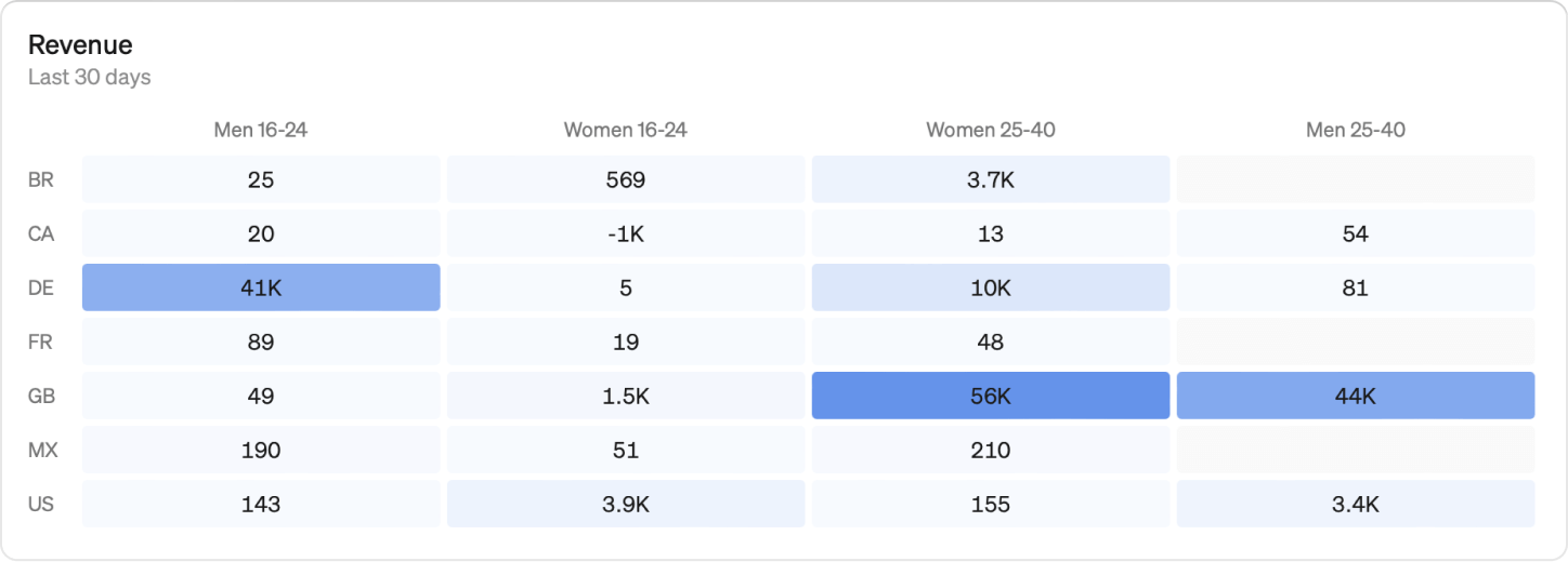
A favorite of management consultants. Break down whatever volume metric you’re interested in to find the segments that make up the largest share of the total. For example:
- Revenue by Customer Category and Size
- Returns by Product category and Country
This works because usually, all your distributions are skewed (see Pareto principle), where 20% of your customers can make up 80% of the problem/potential. Smart teams find out which sub-segments actually matter for a given problem and focus their efforts on that. Always do this analysis before starting a project.
2. User behaviour patterns
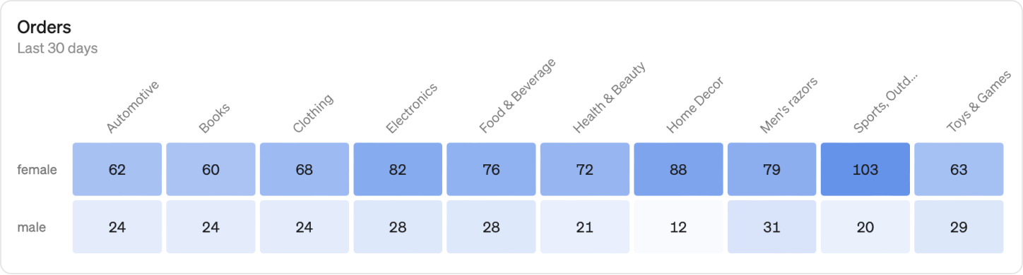
An exploratory way to find patterns in user behavior. We used this technique early on at Spotify to get insights into what kind of music different types of users were listening to. For example:
- User engagement by Feature and User segment
- Streams by Genre and User Types
In this analysis, you get a big table with lots of cells, and you’re using the heat map to find whatever stands out - like older users streaming a ton of jazz. Explore different dimensions to find the signal in the noise and use the insights as input to product development and commercial projects.
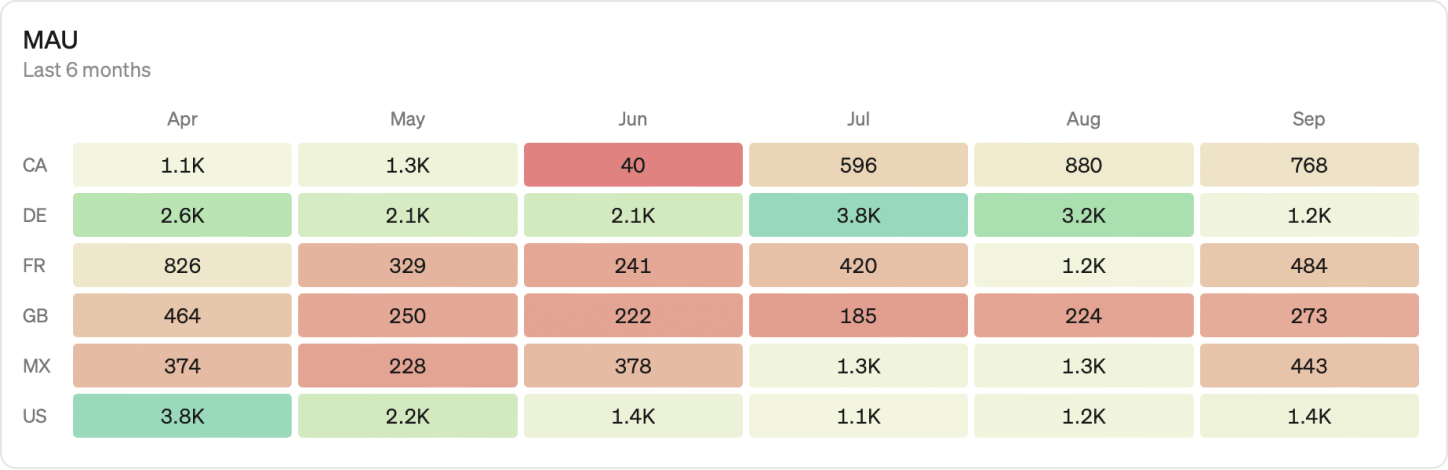
3. Time patterns
A powerful way to explore user engagement over time. Use days or weeks as the columns of your pivot table and individual users or customers as the rows, for example:
- Was Active by User and Days
- Number of Active users by Organization account and Weeks
This gets you a big map of engagement that helps you see a number of different patterns. You can spot if users are active every day in streaks or every other day regularly, if weekends are different than weekdays, and how certain customers are ramping up or down their usage. Use this analysis to understand the underlying patterns that are driving your top-level metrics.
Pivot tables are one of my favorite visualizations for uncovering insights. By applying strategic 80/20 analysis, exploring user behavior, and examining time patterns, you can turn complex data into clear, actionable insights that can be communicated effectively.
Steep
Steep is a modern alternative to BI tools like Tableau and Looker that helps data teams work smarter and empower their entire company to explore, analyze, and use data daily. With Steep, data teams focus on building a robust semantic layer, leaving the day-to-day analysis and content creation to business users.
Book a demo
Get help with exploring the platform and discussing use cases for your team.
Get started
Explore for free. Get your own workspace or try the demo setup.
More posts

Intro to Steep
By Janna Pollari·Events

Webinar with Daana
By Janna Pollari·Events

Meet us at Snowflake Summit 2026
By Deanne Anderson·Events
Introducing Steep AI
By Nino Höglund·Product

A builder's guide to the Steep API
By Hanna Kjellén·Inside Steep

New in Steep: API – Metrics power anything
By Nino Höglund·Product