We’re thrilled to introduce the newest feature in Steep – maps. Traditionally, maps were time-consuming to build, required a specialist and offered limited flexibility for end users. With maps in Steep, anyone can create rich, location-based visualizations in seconds – fully integrated with the semantic layer.

A new approach to maps
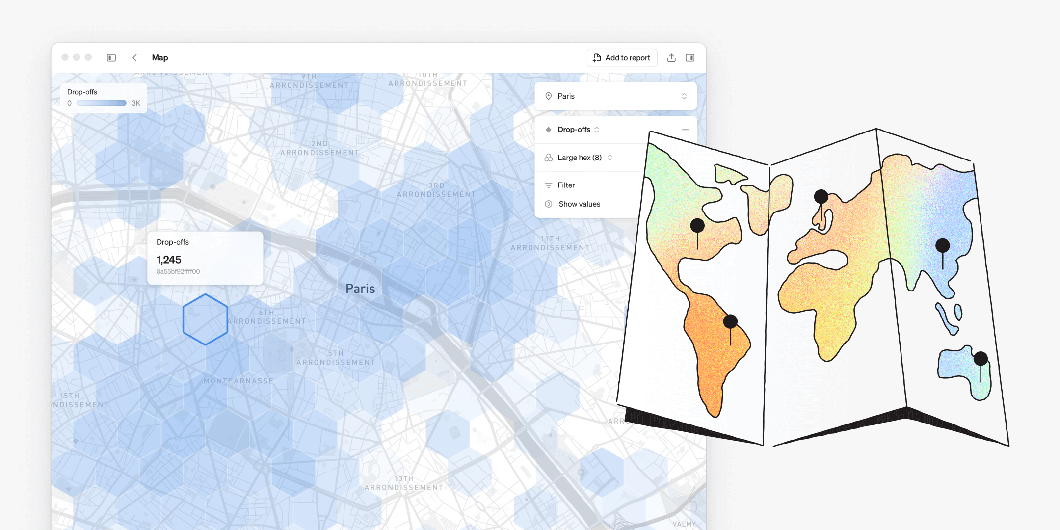
Steep introduces a new take on maps in BI – simple, intuitive, and made to be explored by everyone. Just open the map and dive into your metrics instantly.
- Add real-world context to any metric with geo-data in seconds
- Explore location-based trends and patterns flexibly
- Create customized map visualizations to track and compare performance across locations
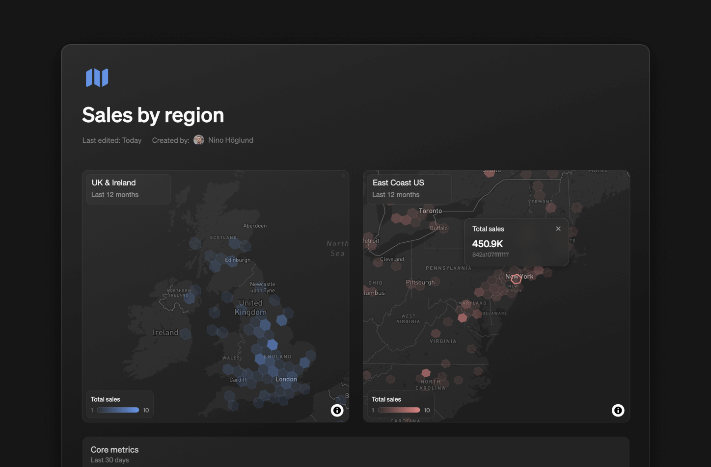
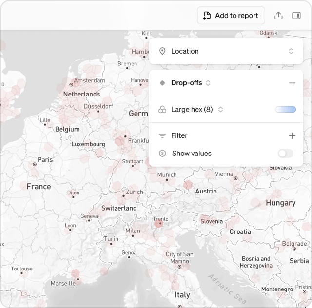
Add unlimited map blocks to your reports to track and compare the performance of different metrics, time periods, or regions – side-by-side.
Discover the world in H3
Steep uses the global H3 cell index format to bring your data to life on a hexagonal grid. The H3 cell index format makes spatial analysis in BI simple, scalable, and precise:
- Consistent hexagonal grid for clean comparisons
- Multiple precision levels, from country to street view
- Smooth aggregation and zooming across locations
Customize your maps
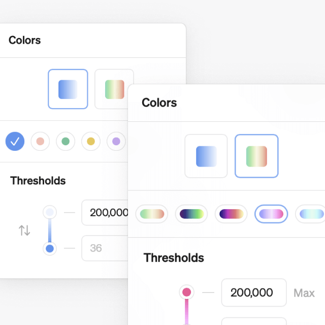
Color-code: Choose from 12 color schemes to find the perfect visualization for each use case, and color-code your maps neatly in reports.
Get started
To put your metrics on the map, convert your geographic data to H3 cell index format. Once set up, everyone in your workspace can start exploring maps freely.
Book a demo
Get help with exploring the platform and discussing use cases for your team.
Get started
Explore for free. Get your own workspace or try the demo setup.
More posts

Intro to Steep
By Janna Pollari·Events

Webinar with Daana
By Janna Pollari·Events

Meet us at Snowflake Summit 2026
By Deanne Anderson·Events

Introducing Steep AI
By Nino Höglund·Product

A builder's guide to the Steep API
By Hanna Kjellén·Inside Steep

New in Steep: API – Metrics power anything
By Nino Höglund·Product